As the Director of Brand Management for the new, fast-growing company Eat Fit Go Healthy Foods, my job is to protect and grow the company's brand. My responsibilities include but are not limited to:
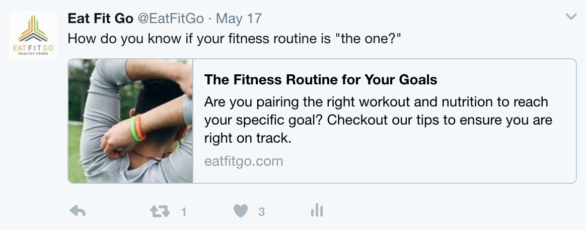
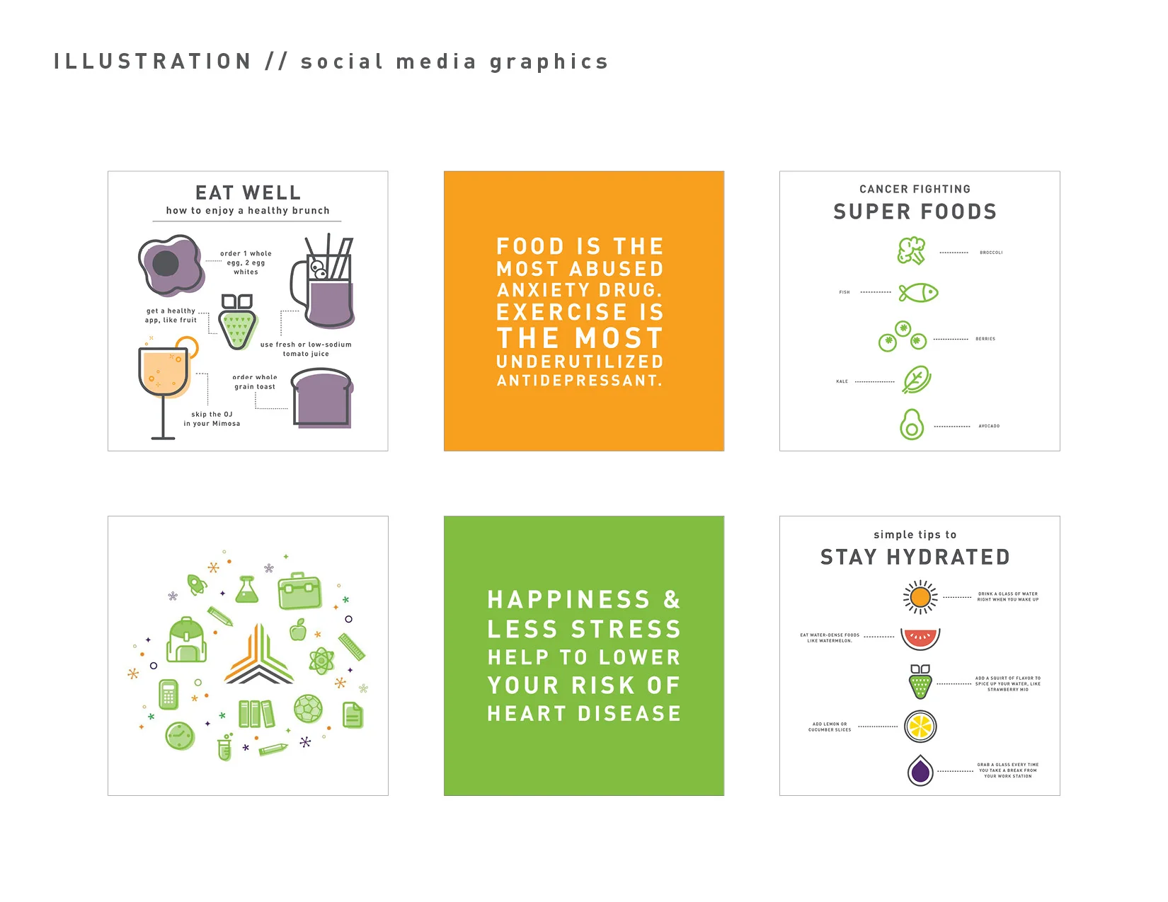
1. Managing and creating content for all Eat Fit Go social media platforms:
• Facebook (including all Corporate and Franchise pages)
• Blog - Write and edit all blog posts
2. Managing all Facebook advertising
3. Work with social media influencers
4. Managing the Marketing Team and all marketing projects, ensuring all deadlines are being met and projects are being executed
5. Manage Franchisee requests and ensuring brand standards are being met throughout all marketing materials and social media pages
6. Event planning and execution with advertising partner Sporting Kansas City
7. Develop campaigns and social media strategy
8. Write press releases
9. Work with team on website redesign
10. Manage all print ordering for marketing, events, franchisees, etc.
My beginning role at Eat Fit Go Healthy Foods involved graphic design and photography/video work, as well as content creation and social media management. My responsibilities included:
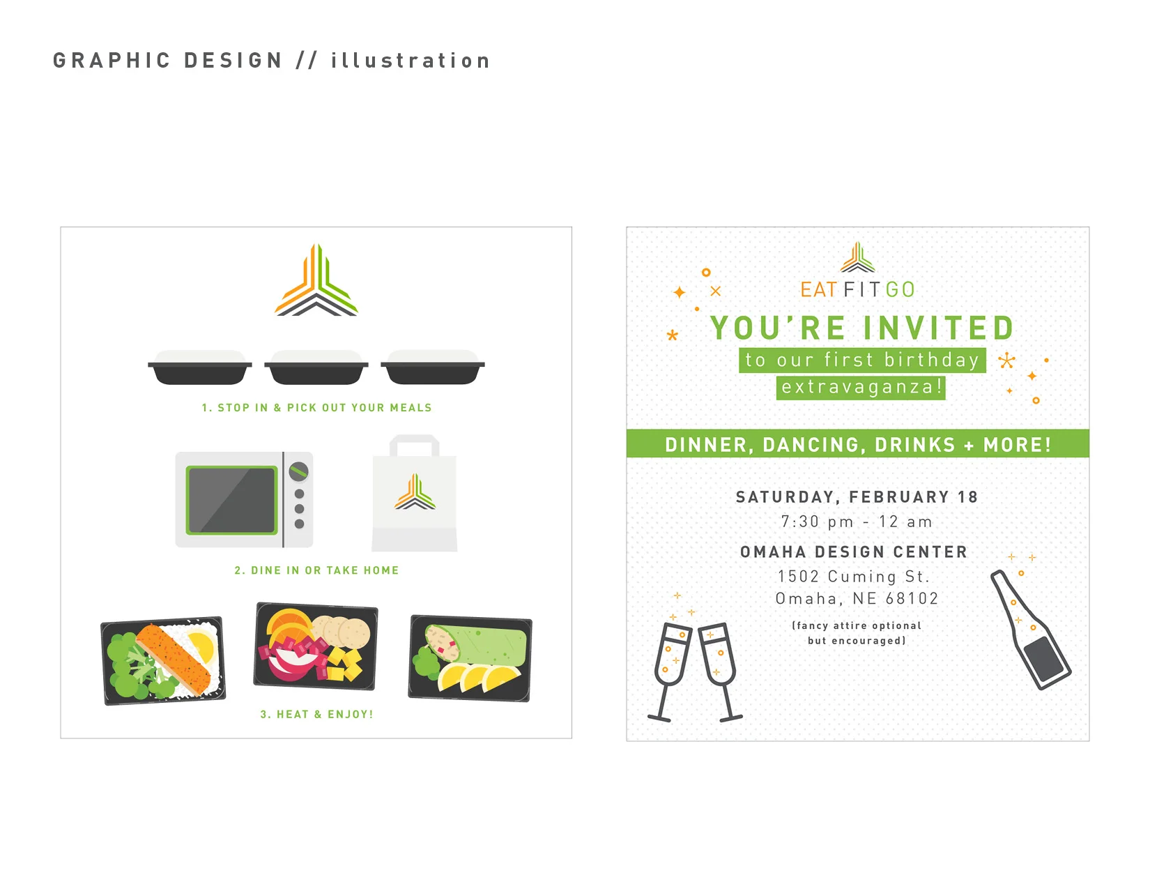
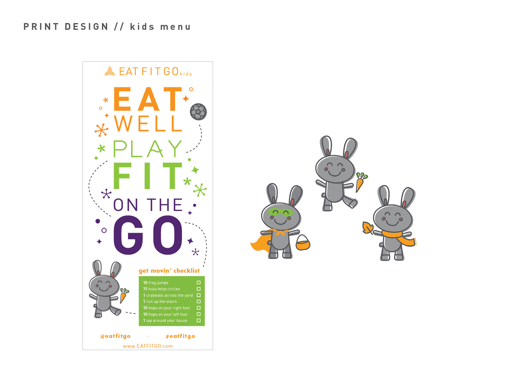
• Graphic Design - all print and digital marketing projects
• Website maintainance
• Video creation for social media
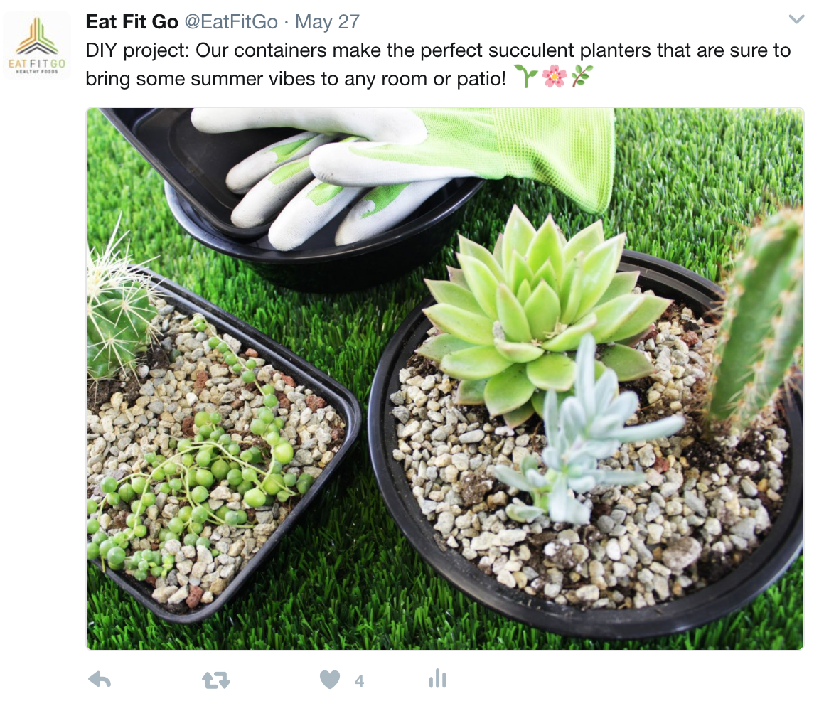
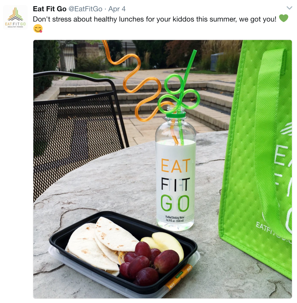
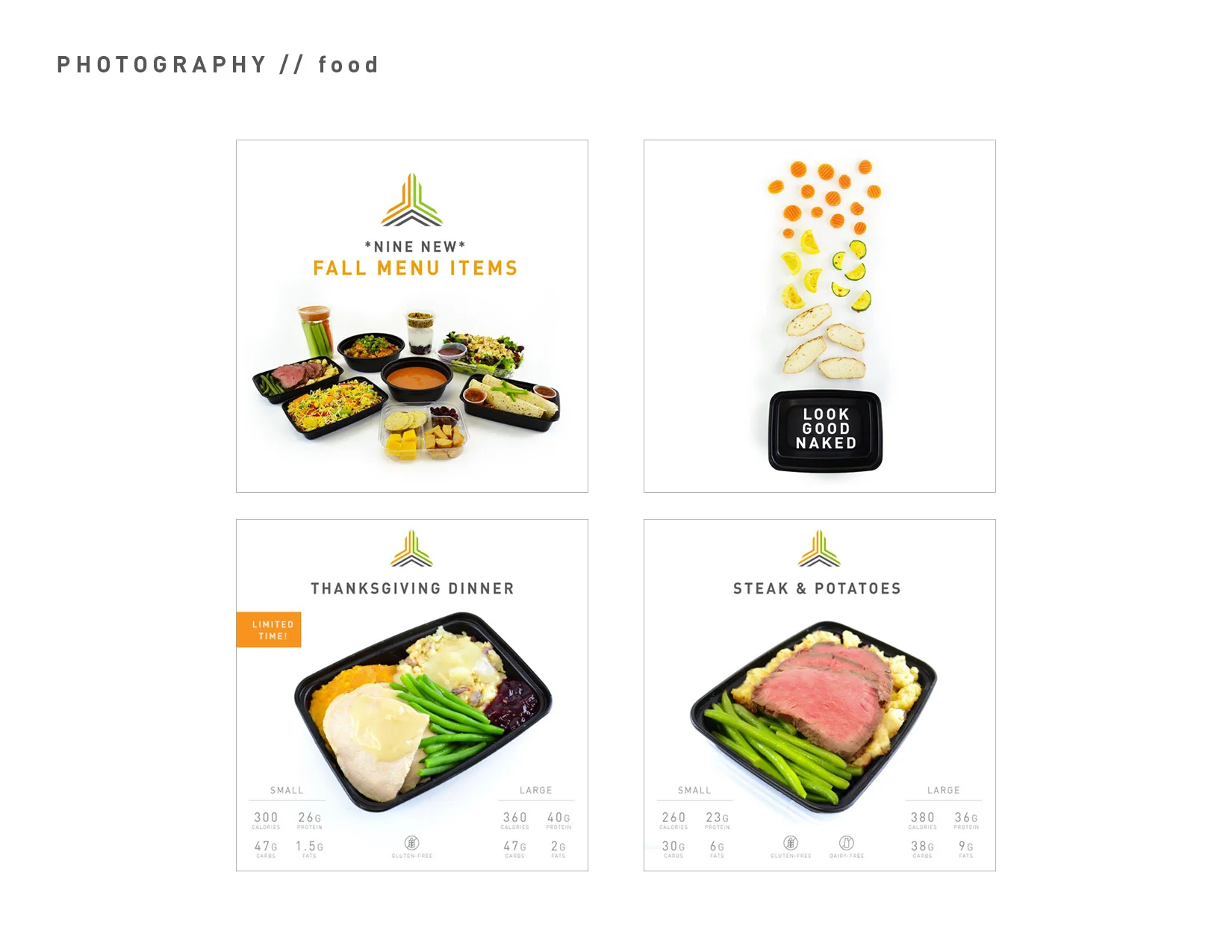
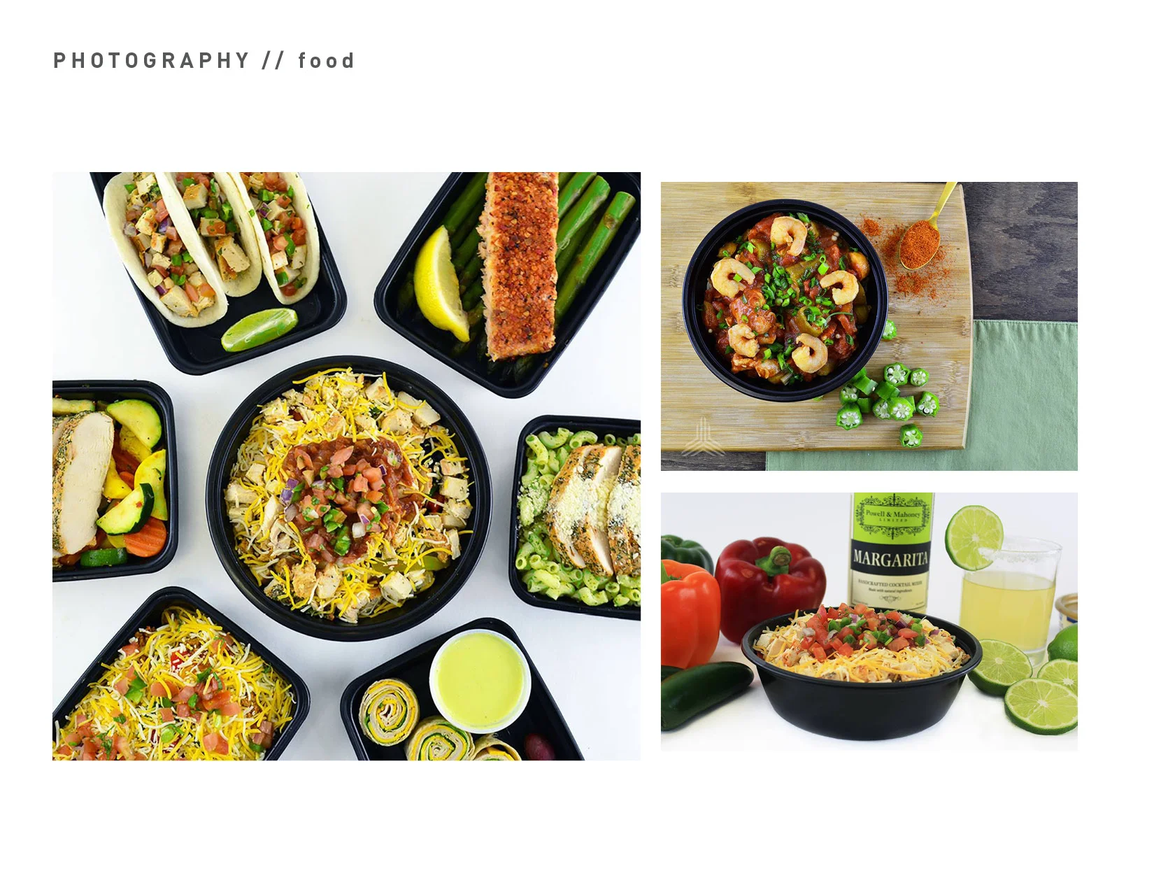
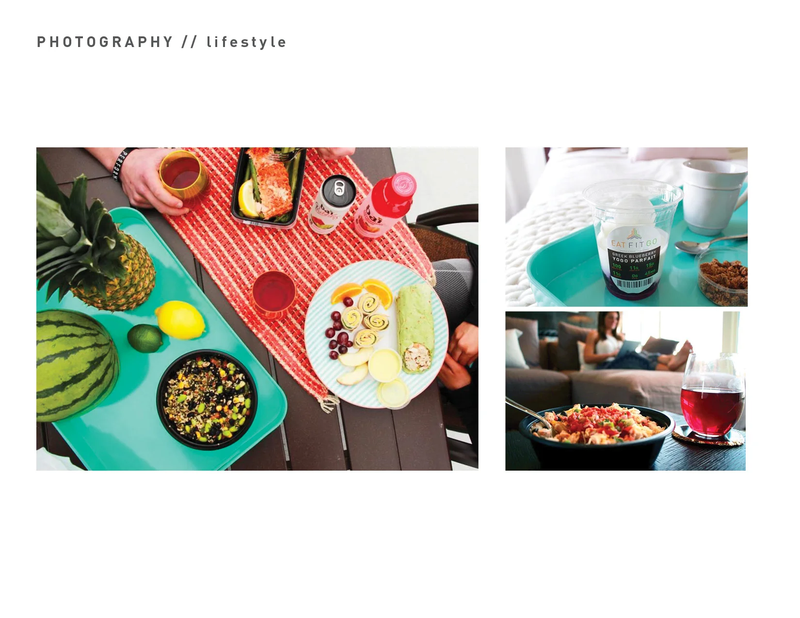
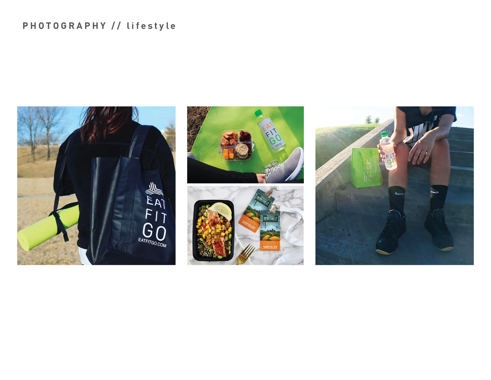
• Photography - food & lifestyle
Ivy Packs is a startup centered around gifting and lifting the lives of college students with fun and thoughtful care packages. I wanted to embody this concept with a very simplistic logo and branding concept to balance the chaos of tests, homework, and late nights.
The logo was based off of the concept of ivy leaves to hone in the feelings of peace, life, and refresh.
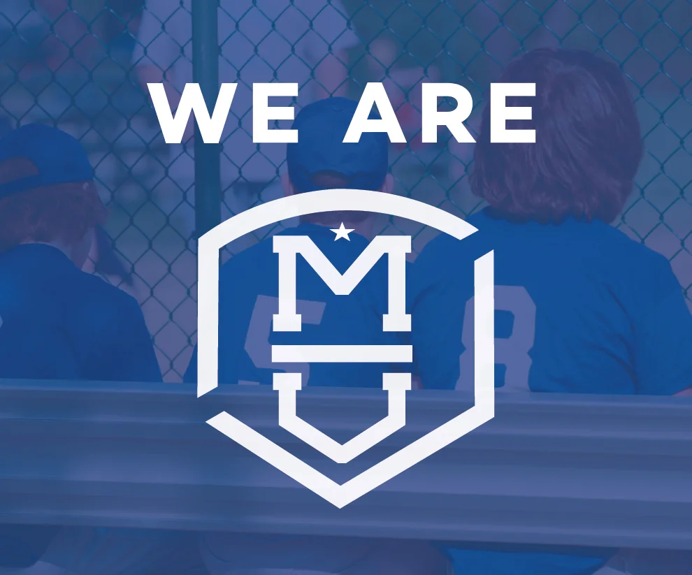
When two of Omaha's largest youth sports organizations joined forces, they needed a fresh look. Millard Athletic Association challenged me with the task of taking the block "M" they've been using for 75 years and create a new modern, youthful logo. For their new brand, Millard United Sports, I created a simplistic mark to represent the merging of two strong companies.
Pine Paks is a box subscription service for young summer campers. They wanted two logo concepts to explore the overall brand tone they wanted to go for. For the first concept, I used earth tone colors and rounded, thin lines to convey a woodsy camp vibe.
For the second concept, I wanted to explore a brighter color palette and sharp lines for a geometric feel, while still representing the camp culture.
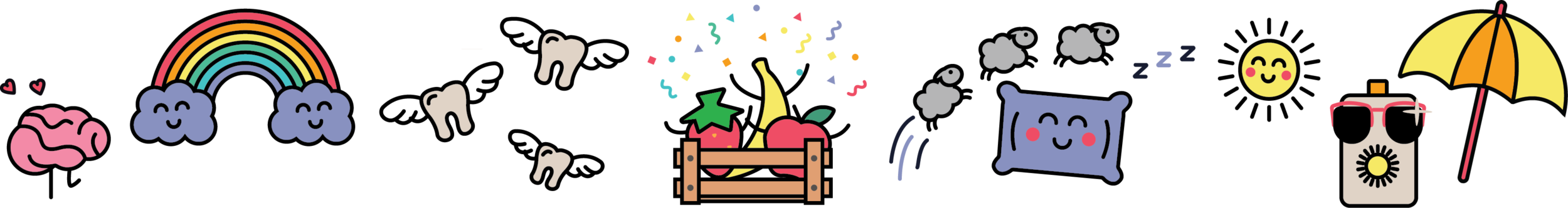
Nelnet’s internal wellness department wanted a fresh campaign to start the new year. I wanted to provide something more engaging and modern than previous campaigns had been. After much concepting, our team developed Wellness World, a video game themed campaign with each month representing a different level. I created colorful, fun characters and badges to make Wellness World stand out and increase associate participation in wellness challenges.
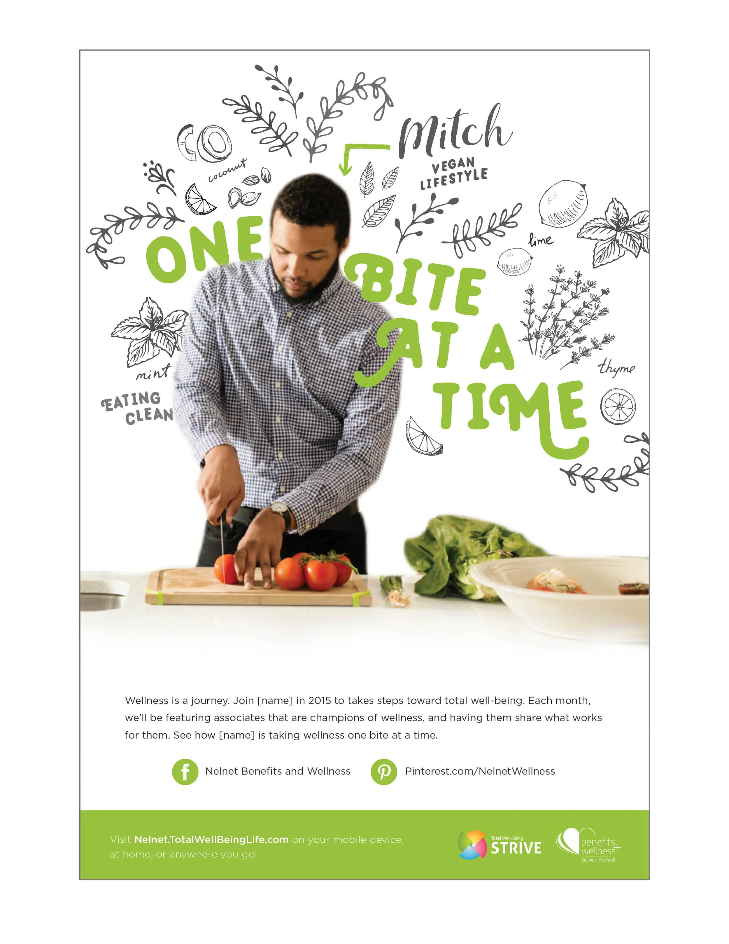
For our second wellness campaign concept, I wanted to use unique design elements that had not been used before on Nelnet’s wellness posters. The Share the Health concept would focus on the individual, combining photography with hand-drawn illustrations.
This poster for Nelnet’s Denver office was created to promote the employee day of service. I wanted to represent the Colorado office with woodsy, line art illustrations as well as communicate the feeling of
community. Each organization where employees would be volunteering is represented by an abstract icon.
The University of Nebraska Press asked Jacht Ad Lab to create a logo for their upcoming 75th anniversary. I created a logo that represents the importance of the Press in the community and pieced together different elements that I feel represent Lincoln.